TOC
Getting started
Ways to explore
Charts are made up of two parts: Queries and Visualizations.
The best way to get started building a custom query is to find a query similar to what you are looking for. To find a query use Library, Spaces, or Boards.
The query selector is made up of many components.
Select
Select the entity. This is the foundation of your analysis. Choose carefully as it determines which metrics and groupings are available to you.
<aside>
There are a lot of entities. See the full list and learn what they can do.
</aside>
Date range
The date range can be relative to today or a custom date range
Filter
Filter on a property of that selected entity
Property Use filters to remove noise and focus on relevant segments. Narrow down your data to focus on what matters.Operator Define how strictly to filter. "Equals" for exact matches, "Contains" for partial matches, "Between" for ranges.Values Set your threshold or criteria. Be specific to get precisely the data you need.Group
Group by a property. Choose how to segment your data. Good groupings reveal patterns - like Cycle Time by Repository
Search
Search to quickly find what you need with keywords across your system Entities and Attributes.
AND Match all terms (default)OR Match any termNOT Exclude termsMeasure
Measure a field to show as a metric.
Metric
This could be numerical values like count of issues completed , or avg. time in meetings per dayAggregation
How to analyze your data: SUM for totals, COUNT for occurrences, Percentiles for distributionField
Refine how your measure is calculated by filtering the underlying data. Useful for focused metrics.Operator
Define the comparison logic for your measure filter. Helps create precise measure calculations.Values
Set specific criteria for your measure calculation. Ensures your metrics reflect exactly what you want to analyze.Formulas
Formulas build custom calculations combining different measures. Use this to create complex metrics like profit margins or custom scores.
Having
Filter on a calculated measure. Useful for finding top performers or identifying outliers. Uses min and max thresholds.
Compare
Compare this data set with a different time range to identify trends.
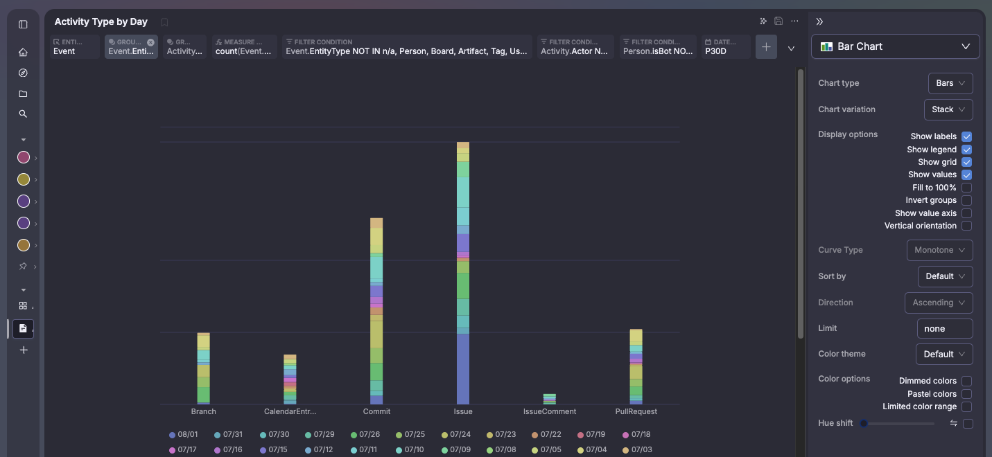
VZBL has a variety of visualization tools, including charts, graphs, and tables.
Data Tables
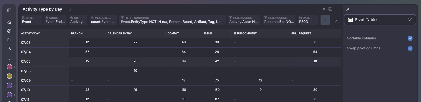
Pivot Tables
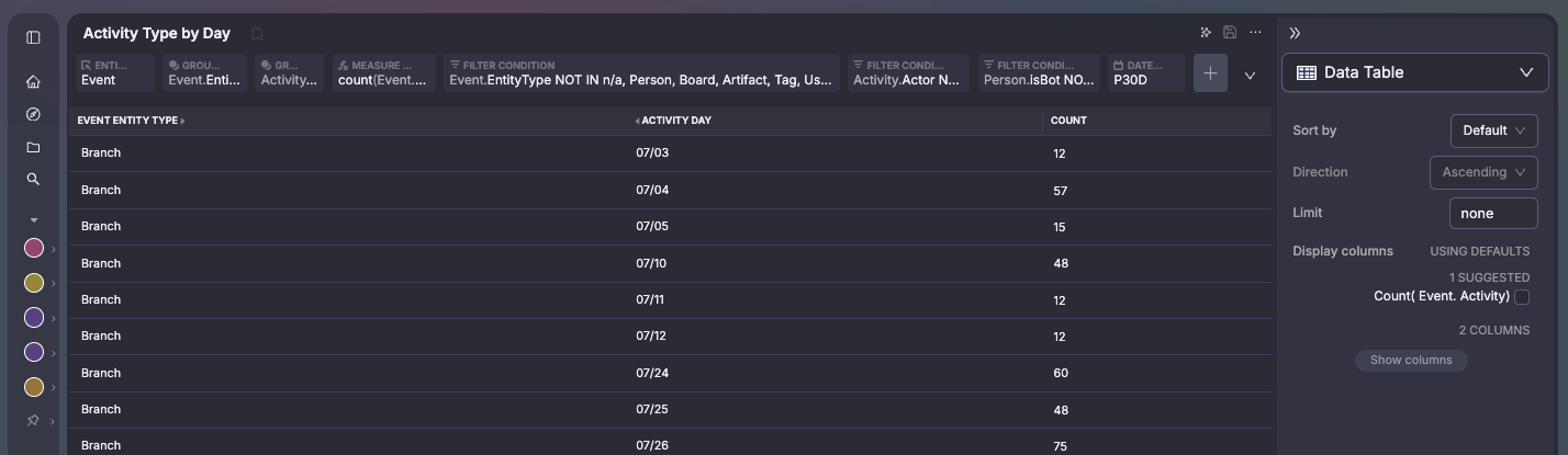
Chart Options
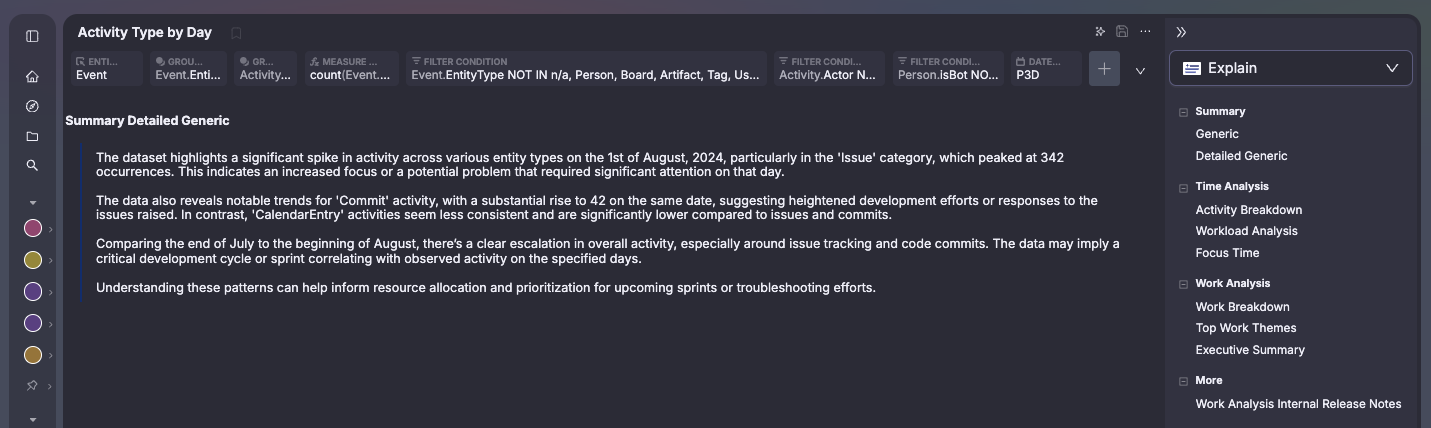
Explain results
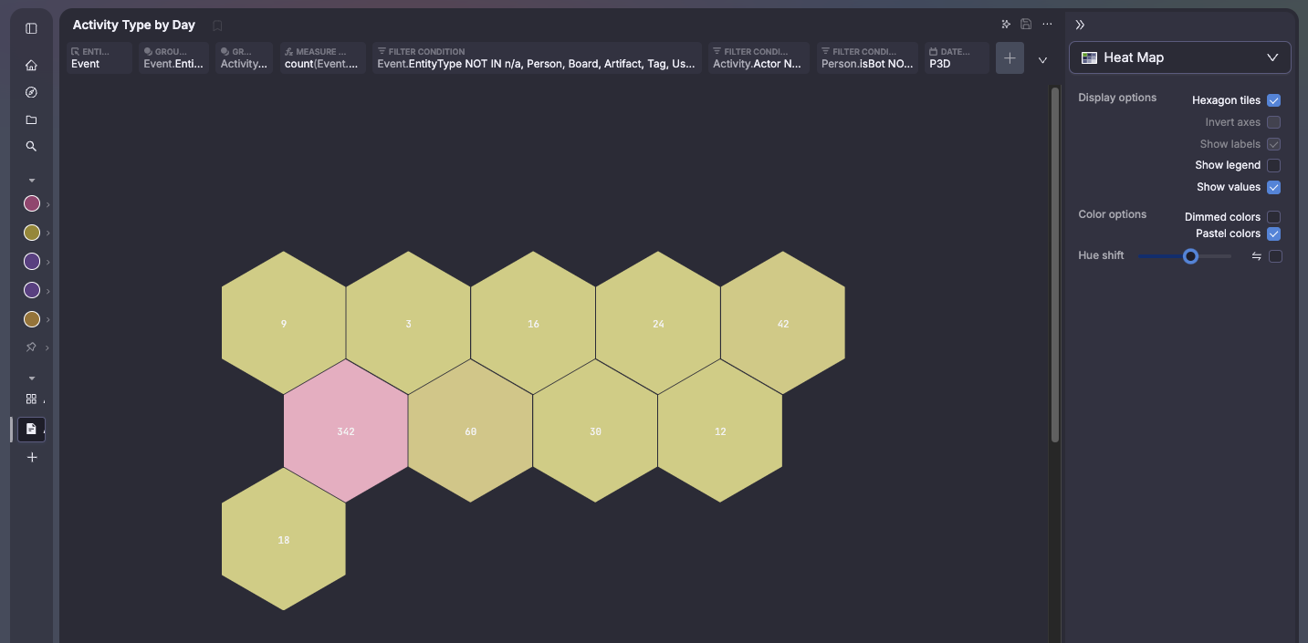
Heatmap Diagrams
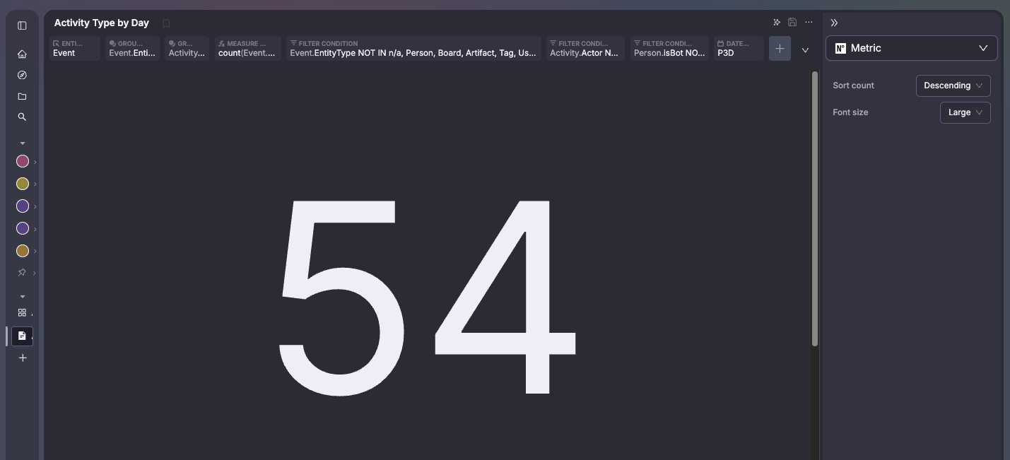
Metric Values
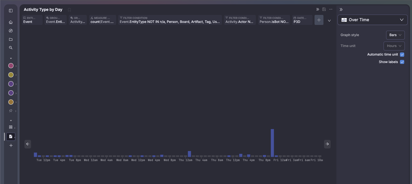
Timeseries
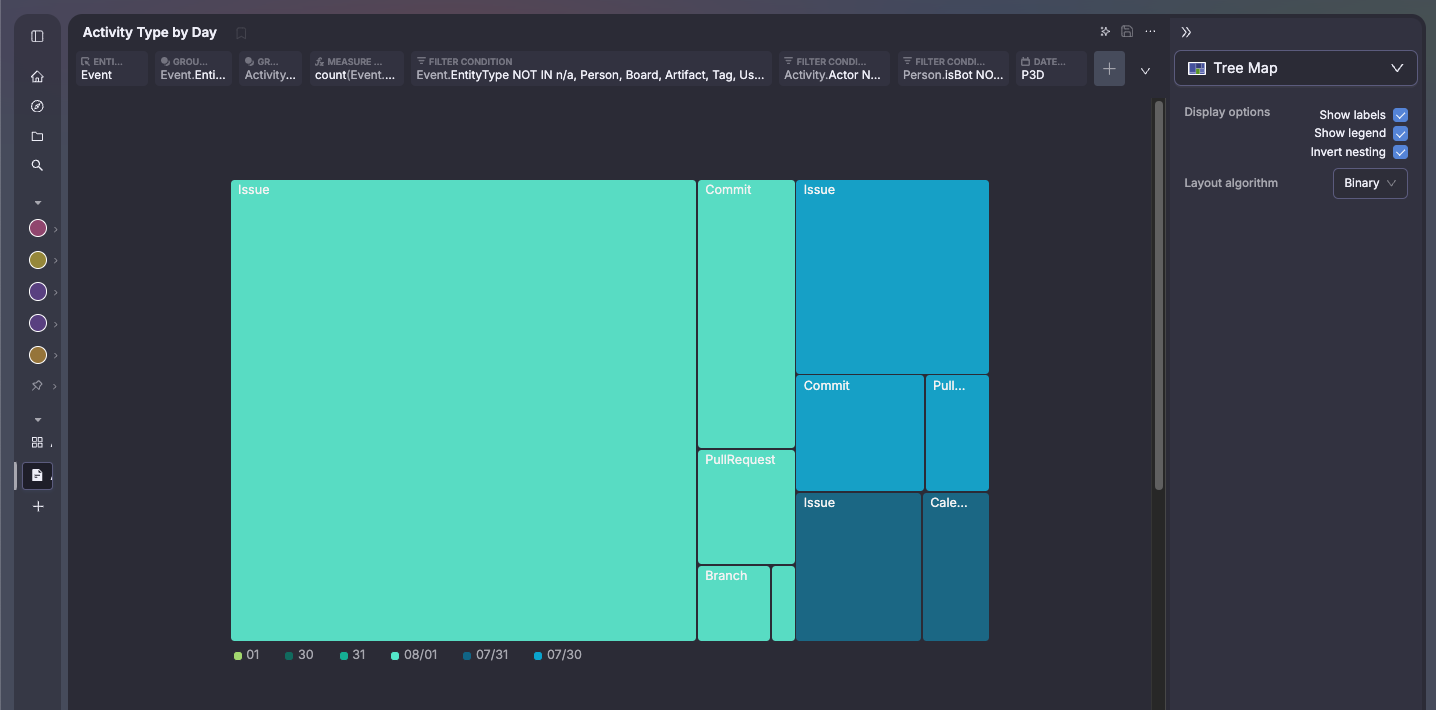
Treemap View
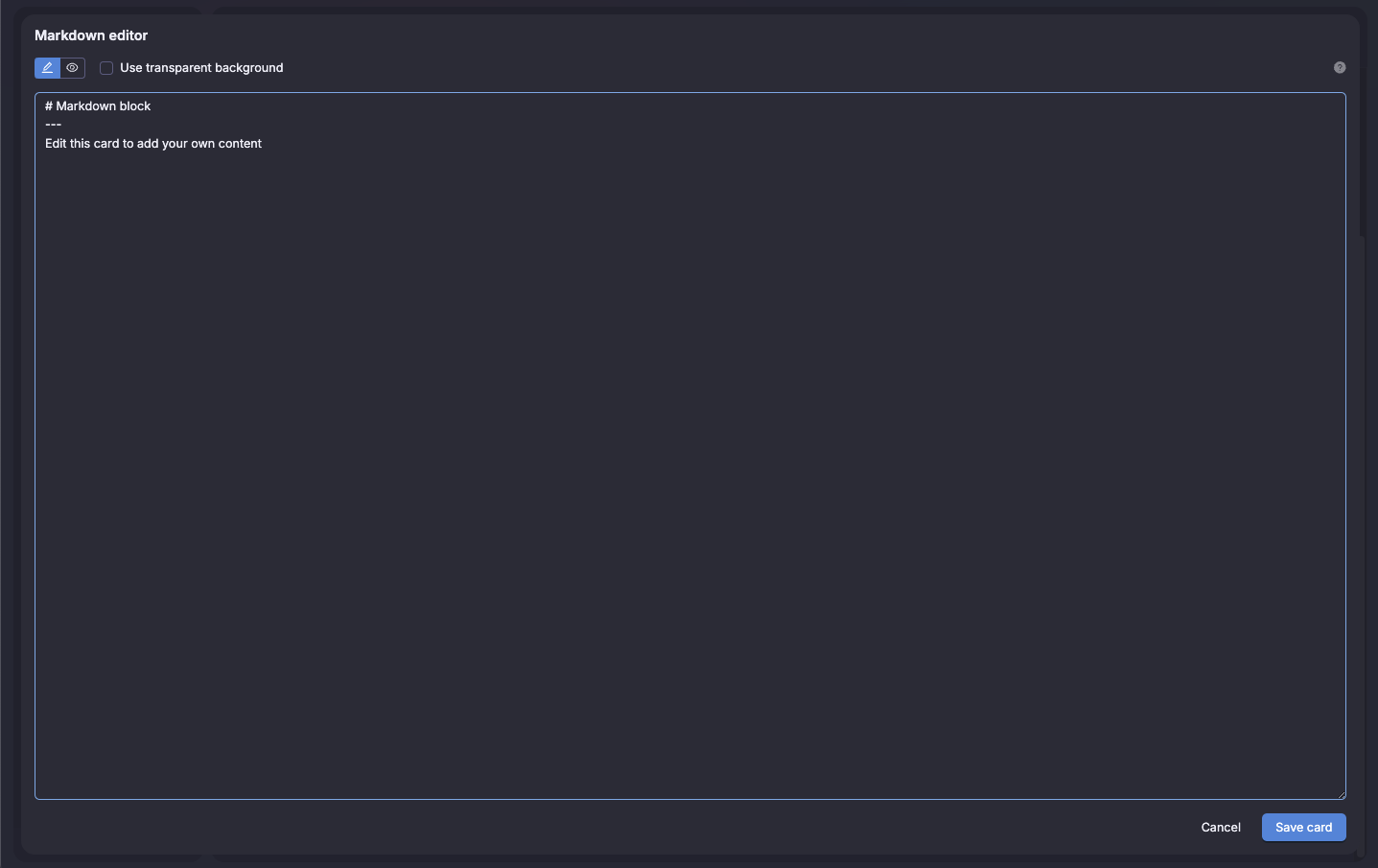
Markdown Support
The charts have a variety of interactions to enable deeper exploration. Different options are available based on the type of data.
Explore these results
Opens to Charts filtered to the data you interacted with, allowing you to change the query or visualizationOnly show and Don't show
Gives controls over what the chart is filtered toShow this _attribute_
Open the entity details for the entity selected